Browsers are sooo out-dated…
How many hours per workday do you spend on the internet? If you’re anything like us… a LOT.
It’s undeniable that the internet’s become an integral part of our daily work. But with that shift comes the need for a new kind of web browser – one that not only functions well, but actually helps you get through your work.
That’s exactly why we built SigmaOS: the first web browser that thinks like you.
🏆 We’ve got news
SigmaOS has been nominated as a finalist for the Best Designed Product of 2022 by Product Hunt. This is huge for us:
20,000+ products were launched on Product Hunt this year – there are 10 finalists.
We’re a team of 5 people, with only 0.5 designers (me), trying to take down the giant that is Google Chrome.
So is SigmaOS well designed?
Don’t take anyone’s word for it: read this post, download the app, and vote for us on Product Hunt if you’re convinced!
🧡Vote for SigmaOS as Best Designed Product of 2022 on Product Hunt!
🧠 Let’s re-think the browser
In 2022, I literally spent all of my waking hours re-thinking the web-browser.
In this post, I’ll be sharing a few of the design details we came up with to make SigmaOS feel unique.
We’ll be nerding out on copy, controversy, color, and more. Enjoy!
I. Teaching SigmaOS your language
To make SigmaOS a browser that thinks like you do, we first need it to speak like you do.
🪦 RIP Tabs
On a traditional browser, you might create a tab for anything – checking out the weather, messaging a friend, opening Netflix…
But realistically, there are two types of tabs:
Recurrent Pages: your Twitter, your favorite blog, your Netflix… You check these every day.
Temporary Tasks: checking the weather, defining a word, looking for flights… You rarely visit the same website twice.
In SigmaOS, we decided to translate this distinction into the language of the app.
✌️ Everything is a Page, and…
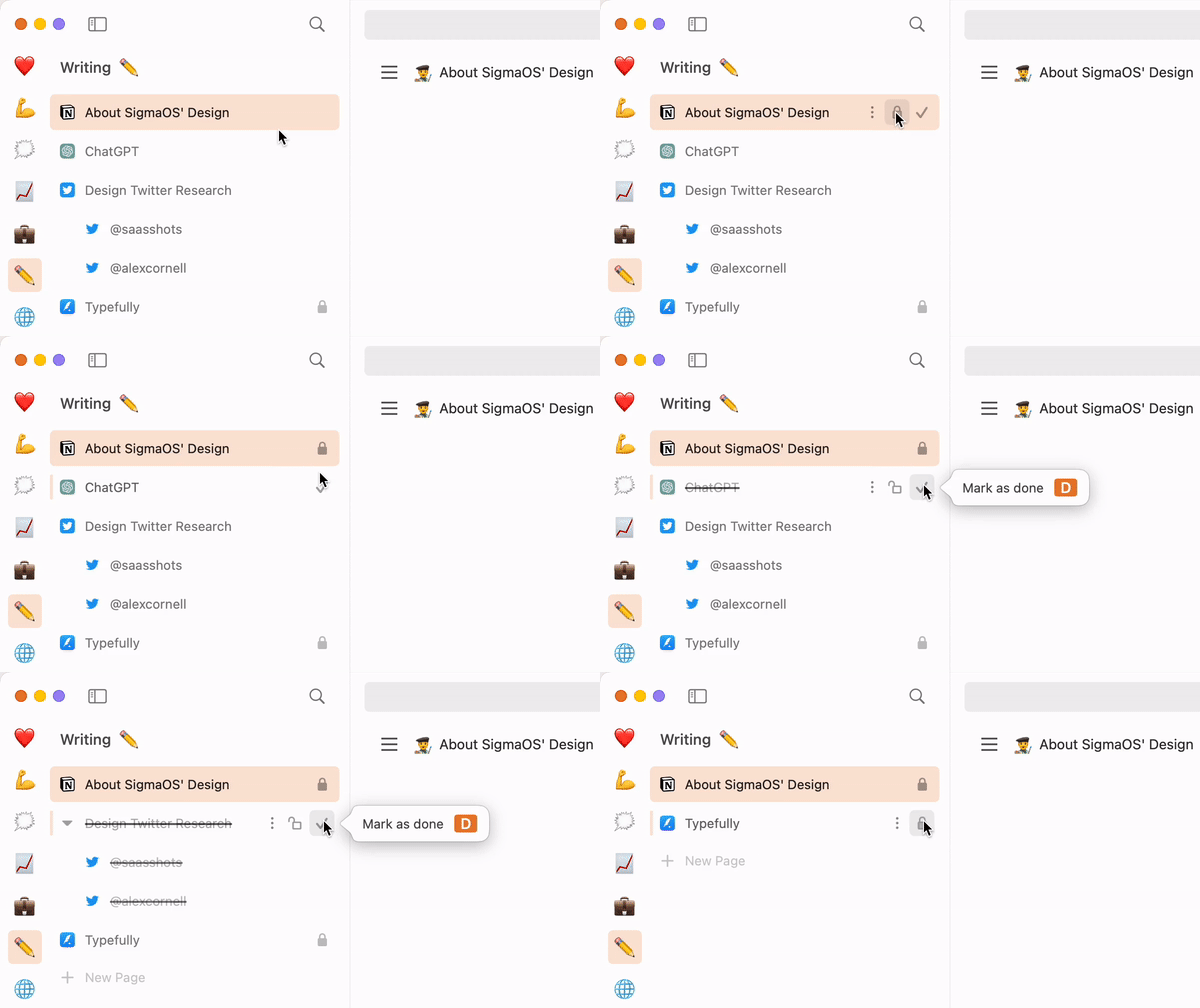
If it’s a temporary task, keep it for as long as you need it, then mark it as done ✔️ and it will disappear.
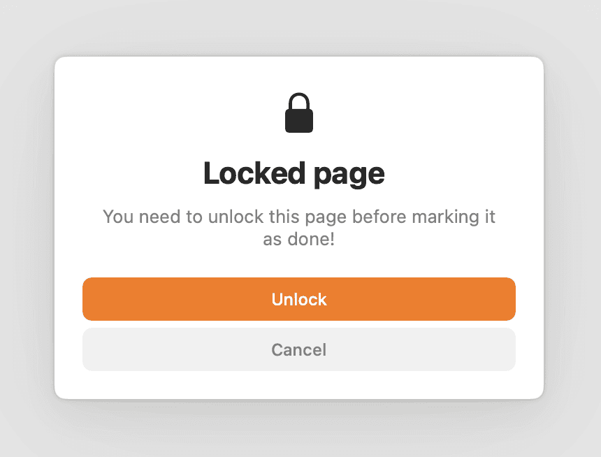
If it’s a recurrent page, just lock it 🔒 to keep it indefinitely. Locked pages can’t be marked as done until you unlock them.
It might seem like an unimportant change. What’s the difference with closing tabs? Aren’t locked pages just pinned tabs or bookmarks?
Turns out, language matters: the satisfaction you get from marking a page as done is incomparable to that of closing a tab. It feels like crossing a task of your to-do list (and it looks like it too).

Ooooohhhh…
More generally, using the right language makes you feel like your software actually understands what you’re trying to do.
Don’t believe me? Try it for yourself.

Locked Pages can't be marked as Done.
II. About Shortcuts
Ah. Shortcuts. I asked our new friend ChatGPT to write a poem about it, and damn does it describe the situation well:
Keyboard shortcuts, a mystery to most
Complicated and hard to master
But learn them well, and you'll be ahead
In power and speed, you'll surpass.
– ChatGPT
Thinking about shortcuts, I couldn’t help but think WHY SO COMPLICATED?
Turns out, they don’t. And they never were meant to.
🏛️ A bit of history
Why do we remember what cmd+F, cmd+P, and cmd+C do? Because they stand for Find, Print, and Copy.
What about cmd+W? Well W stands for Window. So why does this shortcut close tabs? Ew.
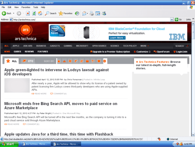
Browser tabs were initially designed to allow users to open multiple websites simultaneously without cluttering the window switcher in their operating system (remember the blue windows bar?). A good solution when you have 5 open tabs, a terrible one when you need over 20.

Remember this?
So, in a pre-tab era, closing a website was equivalent to closing a window. And this relic persisted.
Similarly today, we are stuck with multiple useless shortcuts: why does the letter P still hoard the printing shortcut when no one prints anymore?
A few years ago, Notion received backlash when they decided to map cmd-P to their page search, but today, it’s an accepted norm (for the better!).
In an era where Printing doesn’t matter and Windows are not attached to tabs anymore, we believe it’s time for us to rethink software paradigms and allow them to evolve for the better.
🧘♀️ “In power and speed you’ll surpass”
So, can we make keyboard shortcuts feel faster to use in a browser? What about removing that ugly command key just like Superhuman, Photoshop and Vim did?
Well, turns out if you implement a smart modal and focus system (feel free to nerd out more), you can achieve something powerful.
In SigmaOS, important shortcuts are single-key:
D for Done
P for Passwords
W for Workspace
space to create a new page
But SigmaOS is more powerful than your regular browser. For example, you can have two open pages at one: the main page, and the side page.
This is where modifier keys come in, as augmentations of a shortcut.
shift shifts your focus to the side. For example, shift - D marks your side page as done
option adds an option on top of your standard shortcut. When W creates a workspace, option - W allows you to edit it.

Shift-D marks your side page as done.
✨ In SigmaOS, shortcuts are fast and fast to learn.
Let’s close this with another little poem from our newest artificial friend.
But SigmaOS, a novel app in sight
Introduces a shortcut system that’s so right
A single key press, quick and snappy
Makes navigation in the app so happy.
– ChatGPT
